For this post, I thought I'd take a look at the art AJHQ has for the starter animals and compare them with the originals!
Let's start with a player favourite: The Wolf
Before:
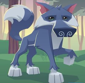
After:
Not a lot has changed with this one! I think the main style differences I can pick out are: rounder paws, more angular nostrils, sharper eyes, and a more defined brow bone.
Next, let's take a look at the tiger:
Before:
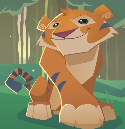
After:
Oho! Some big differences here! In general the new tiger is brighter in colour. It has rounder paws, less stripes on its tail, smaller ears, and the eyes have become less almond-like, and more of a half-moon shape.
Next, the bunny:
Before:
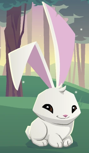
After:
Hmm! This new bunny has more shading going on, the eyes are larger (with bolder colours), and its limbs are less puffy and more angular. It looks like the body has become a bit less chubby as well!
Next, the monkey:
Before:
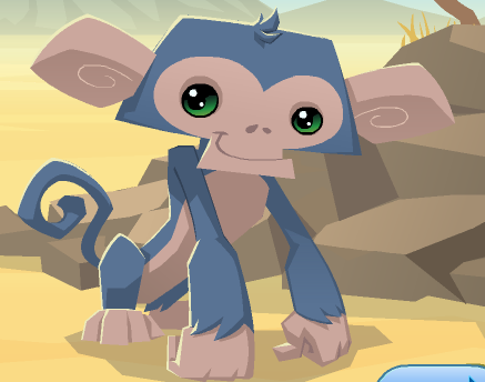
After:
This monkey is relatively similar to the original. The pose is the same, but we see a more updated style with larger pupils, less of a pink tinge to the skin, and more cartoonish limbs (they've lost their muscle tone)
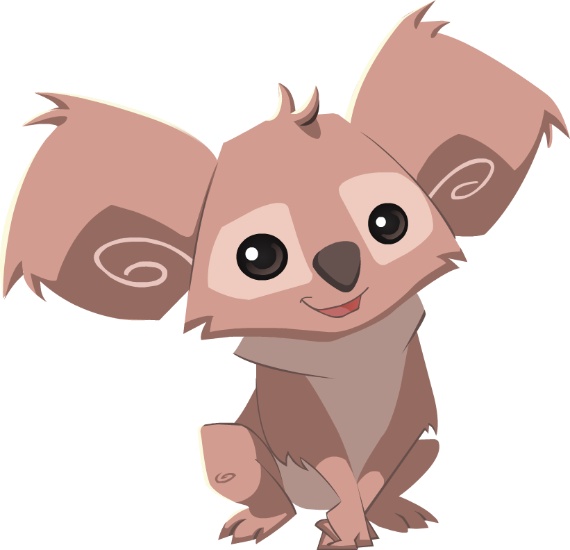
Next, we have the koala:
Before:
After:
This one is quite similar to the original as well! There is a colour difference, and the eyes have become a little more oval-shaped (and, they're purple now!). The patches around the eyes are rounder as well!
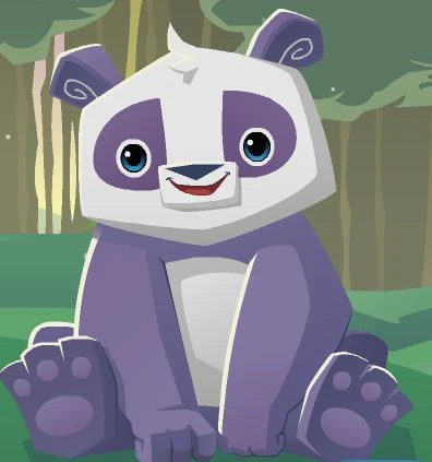
Finally, we have the panda:
Before:
After:
Wow! This one changed a lot! While the colours are the same, there are many differences between the two. The new one has a smaller muzzle and nose, smaller ears, bigger patches around its eyes, brighter eyes with a different iris shape, rounder paws (less hand-like) and has lost its paw-pads.
In conclusion:
As you can see, a lot has changed! The funny thing is: I never noticed it happening! I guess I've become so used to AJ's gradually changing art that I never really noticed how dramatically different the styles are. I wonder if they hired a new head for the art department?
It's changed even MORE since the beta days. Just look at this!
In general, AJ has begun using brighter colours, bigger rounder eyes (with brighter irises), rounder paws, and a generally more cartoonish style.
Personally, I like most of the newer designs better - except for the wolf and koala (I like their original designs)
What do you guys think? New or old? Tell me below!
See you around!








I think that the new is so much cuter and I like it a lot more.
ReplyDeleteAwesome post! I really enjoyed reading it!
I like the new designs and old designs.
ReplyDeleteThis was really interesting, Arctic! The old ones are cool but the new ones are my favorite. ^.^
ReplyDeletei LOVE the new blog backround! its my laptop homescreen XD -penelopeiscute
ReplyDelete